Affordable Laneway Housing: An alternate Vision (Part 1)

We are living through revolutionary times. The 2020 pandemic has unveiled inequity rooted in every system of our society. Colonialism. Racism. The diverging gap between rich and poor. All. Of. It.

Each of us, in our own corner of the world has the obligation to reflect, reimagine and help rebuild the framework for what is to become our new normal post-pandemic.

I design houses for a living in Toronto, and have been digging deep to question the default systems I work in. Who do I actually serve with my work? Who gets to own land in the city and who doesn’t? Why the polarity of tenant vs landlord? Who benefits from this inequity? How can we redistribute housing wealth? How do we build communities where everyone belongs?

I’m starting today by challenging how we think of home ownership— through the lens of laneway housing in Toronto. Here goes.

laneway_housing_co-housing

When Toronto passed a laneway housing by-law in 2018 it was touted as an affordable alternative in established neighbourhoods, well serviced by transit, social and commercial infrastructure, schools and parks. Sounds ideal, right? In reality, laneway suite projects are bespoke luxury builds attainable by very few. The design and construction costs are high, and the primary goal is to get a return on investment as quick as possible. This can take ten to fifteen years, and the rental income needed to get there is unequivocally outside of ‘affordable rent’ limits for most of the population. You must currently be a “have” rather than a “have not” to even own land in Toronto, let alone enough capital to develop land even further. For the traditional tenancy arrangement, you can’t rent out your suite for less than it costs you. Can you?

What if there was a way for the housing secure to tip the balance towards equity for the housing insecure in Toronto? To do it, we need to break out of the own-build-rent-repeat. I propose an alternate vision to laneway suite development that I call the Laneway Lease Network.

Laneway_leasing_network_graphic

How it Works

There are four components of the network: 

The land sharer (formerly known as land owner) offers up the laneway portion of their land for lease to develop a laneway house on. They are matched with a potential leasee based on size and configuration of the lot. For no investment other than sharing the land, they receive a small monthly lease income, and have the future benefit of accruing property value.

The leasee, a former renter accesses a construction mortgage to build the laneway house with the support of the City of Toronto, lives in the laneway house and builds equity in the lease over the next 5-15 years. They own the house they’ve built, and can be lifted out of the rental cycle. 

The lender, a bank or social enterprise lends the money to the leasee to build the house which gets paid back with interest. 

The City of Toronto assesses potential leasees and guarantees the mortgage under its housing affordability program.

The Precedent: The Toronto Islands Trust

The Toronto Islands Trust works in a similar way at a larger scale. The City of Toronto owns the lands of the islands, and offered up a 99-year lease on the lots in 1994. The residents buy a one-time lease, then purchase the house itself. The values of the homes are between 100K-450K and only rise with inflation. When houses trade hands, it’s with a lottery to access the buying of lease when any property gets offered up. There are no windfall profits. The trust controls the buying and selling, helps maintain the infrastructure of the islands, and runs the lottery. Homes are owned by the resident while the City of Toronto owns the land. It’s a long-term land share at a large scale. Learn more about it here.

The Laneway Lease Network uses this model at a smaller, single property scale with a shorter lease of 15 years, ideally supported by the city’s affordability housing plan.

Is this a tenable arrangement for every land owner who wants to build a laneway suite? No. This is closer to co-housing or a social enterprise, so you have to be an outside the box thinker and believe in investing in your community. The Laneway Leasing Network is geared towards those who have land capital and want to contribute to re-balance housing security, house by house, neighbourhood by neighbourhood. Those who want to build longer tables instead of higher fences. Are you one of them?

From Inspiration to Action

To explore the benefits and challenges of the Laneway Leasing Network, I need your help getting a pilot project off the ground. If this idea speaks to you as a land sharer, potential leasee or as a lender/investor, please fill out the form below to join in the discussion. There is a FAQ page to learn more, click here. Get in touch by filling out the form below. Your feedback will shape the pilot project. ~Deborah Mesher, M.Arch BCIN

Winona Dr Renovation

{Progress}

Photo by Trina Turl

Photo by Trina Turl

{Progress}

Ahhhh, wouldn’t it be glorious to soak in here? This interior second floor renovation project for a family of four on Winona Drive in Toronto is ready to be revealed. It all started with the bathroom.

When families share one bathroom on the sleeping floor, the bathroom needs to work HARD. It has to provide room for help with toddler tooth brushing, potty training, room to groom oneself, and goodness willing, a place to soak on a winter’s night.

See? Super cramped.

See? Super cramped.

This second floor bathroom underwent a major transformation from a cramped three piece to a zen four piece washroom. We did this by stealing space from an adjoining room. I know, I know, we don’t usually recommend this in small homes because it makes the other room awkward and useless as a bedroom, but the fourth bedroom was being used as a walk in closet anyhow. Plus we added a sandblasted glass pocket door to squeeze even more out of the space.

Plan drawing of the second floor. We “stole” about 2-1/2" feet from the smallest bedroom.

Plan drawing of the second floor. We “stole” about 2-1/2" feet from the smallest bedroom.

Demolition stage. Oof, that plumbing looked rough.

Demolition stage. Oof, that plumbing looked rough.

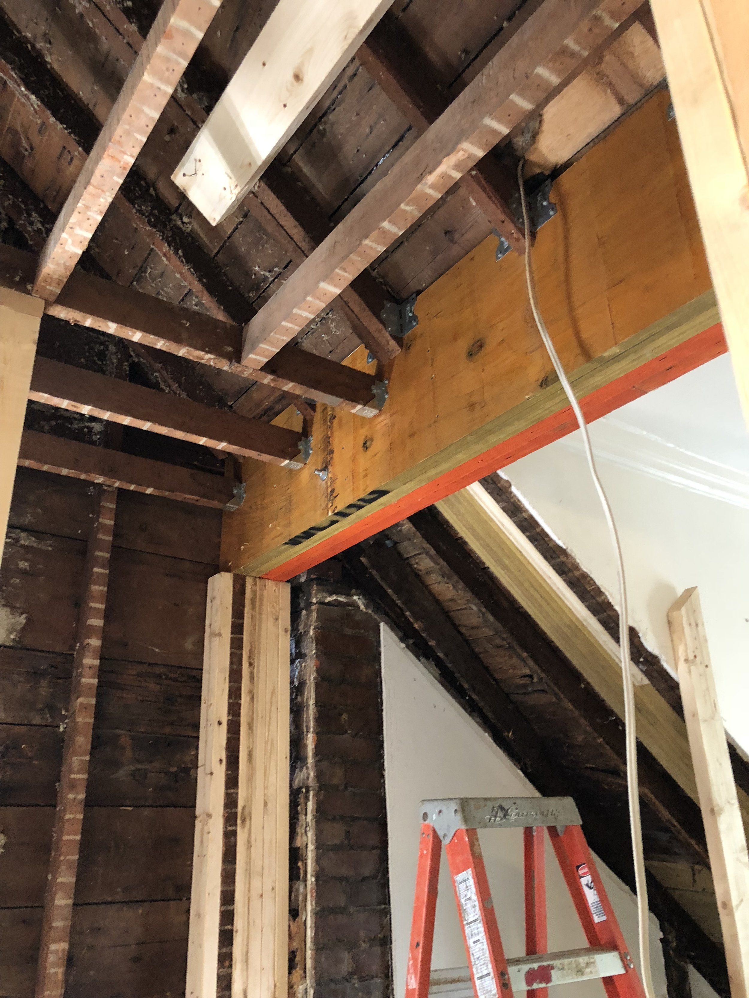
As usual, old homes always hold fun little structural surprises, and this one was no different. After demolition, the main rafters seemed to be held up by paint alone, yet it the house was still standing! We had to scramble to design, repair and reinforce the structure before going ahead. Blackwell Engineering swooped in to consult on this beefy beam.

structural_beam.JPG

Built by Webb and Lashbrook, the renovation also included new custom millwork for closets and a desk in the girls’ bedrooms, as well as new insulation on the side walls and gables and new electrical throughout. It turned out to be a nearly complete gut job of the entire second floor, and it was completed beautifully.

Photo by Trina Turl

Photo by Trina Turl

We can’t take much credit for the impeccable minimalist style, the homeowners had a clear vision for the finishes from the very beginning and we were able to help bring it all together.

Photo by Trina Turl

Photo by Trina Turl

These two sweethearts were so good to let us photograph them! Photo by Trina Turl.

These two sweethearts were so good to let us photograph them! Photo by Trina Turl.

Think a renovation like this isn’t possible for your home? Consider booking a home design consultation with Drôle House to find out. The form is all ready for you below.

Millwood Road Addition

{Progress}

Photo by Melanie Gordon Photography

Photo by Melanie Gordon Photography

{Progress} 

Can you picture yourself brewing your morning coffee here in this serene corner, looking out at the kids in the backyard? Getting this one storey rear addition to a semi-detached home in the Davisville neighbourhood through to the construction phase was anything but serene. The process involved a frustrating experience at the Committee of Adjustment in Toronto that even inspired an informational comic book, which you can download here.

However, the homeowners rolled with the punches the whole way along, and thanks to them and a great team, we got it done. The spaces look and function even better than expected.

Plan view of the 9'x14' addition.

Plan view of the 9'x14' addition.

This family of four wanted to enlarge their small kitchen to be able to host their large extended family for meals, and enjoy the true centre of the home together. We designed a modest rear addition, originally two stories to include a master bathroom and laundry room on the second floor, as well as a small office space in the basement. The project was scaled it back to one storey with a finished basement office.

The unusual property line prevented the addition from going straight back, so we had do so some creative work to seemlessly integrate the kitchen and dining room as one space, connected visually to the exterior.

Below are some progress shots before and during construction.

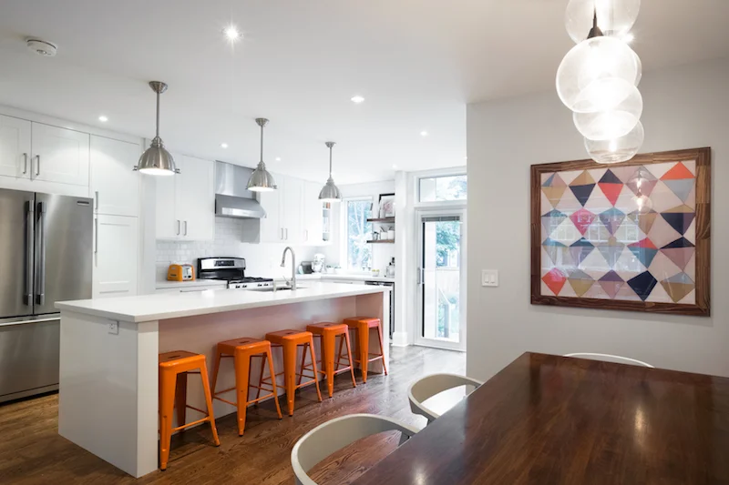
The ten foot island seen from the dining room. Photo by Melanie Gordon Photography.

The ten foot island seen from the dining room. Photo by Melanie Gordon Photography.

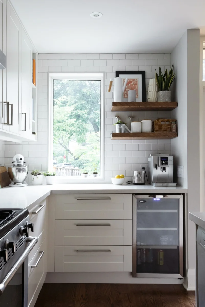
The main showstopper of this space is the ten foot long centre island. It's huge, bright, and has space for everything. There is SO MUCH storage in this kitchen! Linnea Lions interior design made sure of it.

Candyland in the dining room anyone? Photo by Melanie Gordon Photography.

Candyland in the dining room anyone? Photo by Melanie Gordon Photography.

Spaces were styled and decorated by Janet Nielsen. Photo by Melanie Gordon Photography.

Spaces were styled and decorated by Janet Nielsen. Photo by Melanie Gordon Photography.

A normal Saturday morning for these homeowners. Photo by Melanie Gordon Photography.

A normal Saturday morning for these homeowners. Photo by Melanie Gordon Photography.

island.jpeg
office_nook

The renovation also included a small computer desk, with full height storage on either side for art supplies. All said and done, it turned out extremely well.

The one storey addition seen from the backyard patio.

The one storey addition seen from the backyard patio.

Millwood Rd Addition, Toronto Ontario.

Completed March 2018

Architectural design by Drôle House

Interior design by Linnea Lions

Structural engineering by Blackwell Engineers

HVAC design by Anran Building Services

Constructed by Solid Space

Landscaping by Oriole Landscaping

Photography by Melanie Gordon


Ready to transform your home? Book a home design consultation today.

Christie St

{Progress}

The interior first floor renovation for a family of three on Christie St in Toronto.

Marc, Elizabeth and their daughter Emma live in a semi-detached home in central west Toronto. It had a tiny kitchen at the rear of their home cut off from the rest of the main floors by several partition walls. They wanted to open the spaces up, get more light in everywhere, and comfortably be in the kitchen together without bumping elbows.

Front entry

Front entry

Stairway and dining room, before.

Stairway and dining room, before.

Kitchen, before.

Kitchen, before.

demolition
Living room and dining room, during construction.

Living room and dining room, during construction.

Kitchen, during construction.

Kitchen, during construction.

....and now the reveal. These spaces look amazing in the hands of a talented photographer--no doubt--but the main floor was completely transformed. It's white and bright and functional. The family spend a lot of time in the kitchen together now. I squeezed every square inch possible in the front entry and was able to design in a bench and storage. The new frosted door bring the light up as well.

Front entrance, completed. Photograph by Melanie Gordon Photography.

Front entrance, completed. Photograph by Melanie Gordon Photography.

Kitchen, after. Photograph by Melanie Gordon Photography.

Kitchen, after. Photograph by Melanie Gordon Photography.

kitchen
New glass stair guard and railing. Photograph by Melanie Gordon Photography.

New glass stair guard and railing. Photograph by Melanie Gordon Photography.

BUDGET: 110K

Completed: October 2017

Constructor: RTC Construction

Design: Drôle House

Photographs copyright ©Drôle House 2018. All rights reserved. 

Boardwalk rebuild

{Progress}

I was invited to re-design the beachfront of a cottage property in Catalone, Cape Breton, Nova Scotia that I had previously designed in 2000. The beach has been used and continues to be used by a dozen or more families every summer. The challenges for the 2017 project were to create a shareable common space between the two properties joined at the beach, to provide a 360 degree view life guard station, to reuse parts of the existing removable dock structure and large boulders, establish an area for kayaks, provide safe and easy access for kids to the water, flexible seating arrangements, create a seawall for erosion control including a bridge over a freshwater stream. That's kind of a long list, right? 

It doesn't look too bad here, but this is windswept remnant of the former dock and sitting area. Existing gazebo up the hill in the background.

It doesn't look too bad here, but this is windswept remnant of the former dock and sitting area. Existing gazebo up the hill in the background.

The result was a concept with three part:

1. A large shaded deck to share between properties

2. The screened gazebo/lifeguard station on the point

3. An elevated winding boardwalk to connect the two

Preliminary design, including relocating the gazebo, the boardwalk/bridge, semi-submerged boulders, deck and stepped seating down to the water line..

Preliminary design, including relocating the gazebo, the boardwalk/bridge, semi-submerged boulders, deck and stepped seating down to the water line..

Gazebo on it's new point- boardwalk in progress.

Gazebo on it's new point- boardwalk in progress.

A view to the new seawall with partial boardwalk framing.

A view to the new seawall with partial boardwalk framing.

View to the boardwalk below that jogs around the gazebo.

View to the boardwalk below that jogs around the gazebo.

A view to the steps that lead to the beachouse.

A view to the steps that lead to the beachouse.

A larger view from the beachouse deck to the new gazebo location and boardwalk beyond.

A larger view from the beachouse deck to the new gazebo location and boardwalk beyond.

Framing spans across the (currently dry) stream.

Framing spans across the (currently dry) stream.

The boulders and rocks used as foundation for the structure shore up parts of the beach against erosion. The light framing for the boardwalk span over sensitive slopes and vegetations, and care was taken to maintain trees and shrubs whose roots help protect the bank, as well as to keep prized blueberry patches easily accessible to tiny passersby!

The 12'x24' common deck structure with herringbone cedar decking pattern- in progress.

The 12'x24' common deck structure with herringbone cedar decking pattern- in progress.

The aluminum dock structure attached to the new boardwalk and gazebo.

The aluminum dock structure attached to the new boardwalk and gazebo.

A few of the 20+ cousins and relatives perched on the boulder + stone steps adjacent to the dock.

A few of the 20+ cousins and relatives perched on the boulder + stone steps adjacent to the dock.

One of my favourite outcomes of the project was that children LOVE to run back and forth along the boardwalk, just as I had hoped.  The semi-submerged boulders became welcome rest spots during swimming, and were nicknamed "mermaid rocks". This new beachfront will be enjoyed by many families for years to come.

beach_in_use
A view westward on Catalone lake from the completed upper boardwalk. Cedar railing with wire guards.

A view westward on Catalone lake from the completed upper boardwalk. Cedar railing with wire guards.

*A special thanks to Rose Taljaard for many of the photographs.

~Deborah

Postcard 12

{Postcard 12}: "How can I get the most out of a large closet?" - Submitted by Divyang

{Postcard 12}: "How can I get the most out of a large closet?" - Submitted by Divyang

Divyang and Kushbu's toddler son has an underused closet in his room, and they want it to put it to better use. They wonder if there are any hidden opportunities in this tall, squarish enclosed space. 

Divyang's design challenge includes:

  • a 35"Wx40"Dx100"H enclosed closet with no organized shelving currently
  • the need to store LOTS of beloved toddler books, clothes and diaper boxes
  • an adaptive layout that their son could grow into without having to rebuild it completely 

The suggested closet layout has three parts that turns it into a mini-library and play space. The first part is a 18" deep shelving unit with two levels, one for books within reach for a toddler, the higher level for folded clothes and diapers. The second is a narrower 8" shelving unit with integrated ladder affixed to the wall and ceiling. The third is a netted crow's nest that makes use of the upper 30" of head space, which also includes a new opening (netted for safety) above the existing closet door. 

A strip of LED lighting can be installed beneath the lowest bookshelf to brighten the pillow-covered toddler sized reading nook on the floor. That bookshelf is within reach, but the upper clothes +diaper one above is just beyond toddler grasp. Similarly, the first rung on the ladder is off the floor by two feet, which means only kids aged 3 and up will be able to hoist themselves up there to reach the crow's nest. The upper crow's nest/hideout then is suitable for kids aged 3-8.

As their toddler grows into a tween, the modification to the layout would be to:

  • remove the ladder and 8" shelf unit
  • lower the 18" unit to dresser height and add drawers
  • cap the upper opening with a panel in the same style of the existing door
  • convert netted crow's nest into traditional upper shelf for long term storage

The hanging rod stays at the same 5'6" height in both versions. Just a few screws to remove, holes to patch and voilà!

Could your closet be this fun?

~Deborah